

Vinyl Graphics - help me decide...
 07-19-2012, 12:51 PM
#1
I have been working with Chris at Raceline Digital to come up with some vinyl graphics to update the look of my 88 Baja Force 235. We have settled on a general design idea, but I have made some very minor tweaks to it, and I can't decide if I want to go with a newer Baja logo on the lower rear of the hull, go with the "old school" Baja sun logo, or leave the logo off altogether. Take a look and let me know what you think. Thanks!
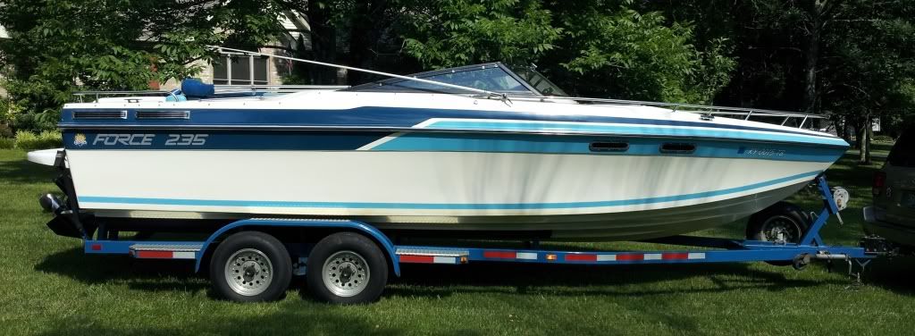
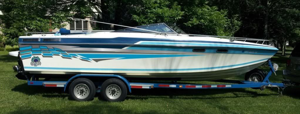
First, what it currently looks like. I want to eliminate the "Force 235" logo because I think it makes the boat look dated. I considered just removing the letters and leaving it that way, but they have been on there for 30 years, so I am sure there will be a "shadow" left over. I probably have no choice but to cover that area with something else.
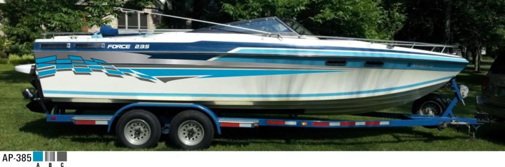
Here is Chris's take on a design for the new graphics. We had to try to blend the new graphics with the older ones. Not really sure why he put the "Force 235" back on the hull.
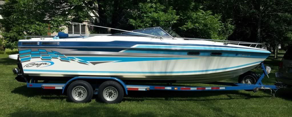
Here I have made some very minor tweaks to Chris's design. I changed the "hook" in the silver stripe and moved it further aft, and I cleaned up the checkers in the flag a little bit. I also incorporated the newer Baja logo:
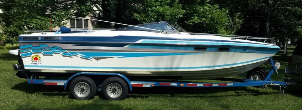
This one is the same as before, but I tried the original "old school" Baja sun logo like what came on the boats of that era. I kind of like these because you don't see them that often:
Finally, I changed the old school logo to match the colors on the boat:
I don't really have one with the updated graphics and no logo, but you can get an idea of that from Chris' first attempt.
Sound off and let me know what you think!
First, what it currently looks like. I want to eliminate the "Force 235" logo because I think it makes the boat look dated. I considered just removing the letters and leaving it that way, but they have been on there for 30 years, so I am sure there will be a "shadow" left over. I probably have no choice but to cover that area with something else.
Here is Chris's take on a design for the new graphics. We had to try to blend the new graphics with the older ones. Not really sure why he put the "Force 235" back on the hull.
Here I have made some very minor tweaks to Chris's design. I changed the "hook" in the silver stripe and moved it further aft, and I cleaned up the checkers in the flag a little bit. I also incorporated the newer Baja logo:
This one is the same as before, but I tried the original "old school" Baja sun logo like what came on the boats of that era. I kind of like these because you don't see them that often:
Finally, I changed the old school logo to match the colors on the boat:
I don't really have one with the updated graphics and no logo, but you can get an idea of that from Chris' first attempt.
Sound off and let me know what you think!
Last edited by Budman II; 07-19-2012 at 12:54 PM.
 07-19-2012, 04:24 PM
#6
You might try and take the third pic and stretch/rotate/squish the logo into the whole oval'ish area under the flag.
__________________
Throttles- Cleveland Construction 377 Talon
08 OPA Class 1 National Champion
08 Class 1 Geico Triple Crown Champion
08 OPA High Points Champion
10 OPA Class 1 National Champion ( happy now Ed! )
Throttles- Cleveland Construction 377 Talon
08 OPA Class 1 National Champion
08 Class 1 Geico Triple Crown Champion
08 OPA High Points Champion
10 OPA Class 1 National Champion ( happy now Ed! )
07-19-2012, 04:27 PM
#7
Platinum Member
iTrader: (6)
ya, remove the force, but put the new BAJA logo up in the silver area just in front of the swoosh
 07-19-2012, 04:50 PM
#8
dont adjust your graphic dependent on the water line, it will only look good sitting static at a dock. Make the graphic look good when running, if you squish it all up into the space above the waterline it wont look right.
You might try and take the third pic and stretch/rotate/squish the logo into the whole oval'ish area under the flag.
You might try and take the third pic and stretch/rotate/squish the logo into the whole oval'ish area under the flag.
07-19-2012, 06:36 PM
#10
yep, dont be afraid to change the aspect to fit the general shape of that area there and it kinda looks like you can do some creative combination with that lower stripe. Try making it real big once to take up most of that space (match the logo with the bottom of the flag but leave some space, the curve looks very similar) even if part of it's cut off by the hard chine at the bottom. The mind/eyes ability to foreshadow will fill in the missing piece (sometimes) . . . .
__________________
Throttles- Cleveland Construction 377 Talon
08 OPA Class 1 National Champion
08 Class 1 Geico Triple Crown Champion
08 OPA High Points Champion
10 OPA Class 1 National Champion ( happy now Ed! )
Throttles- Cleveland Construction 377 Talon
08 OPA Class 1 National Champion
08 Class 1 Geico Triple Crown Champion
08 OPA High Points Champion
10 OPA Class 1 National Champion ( happy now Ed! )
Last edited by glassdave; 07-19-2012 at 06:40 PM.

