

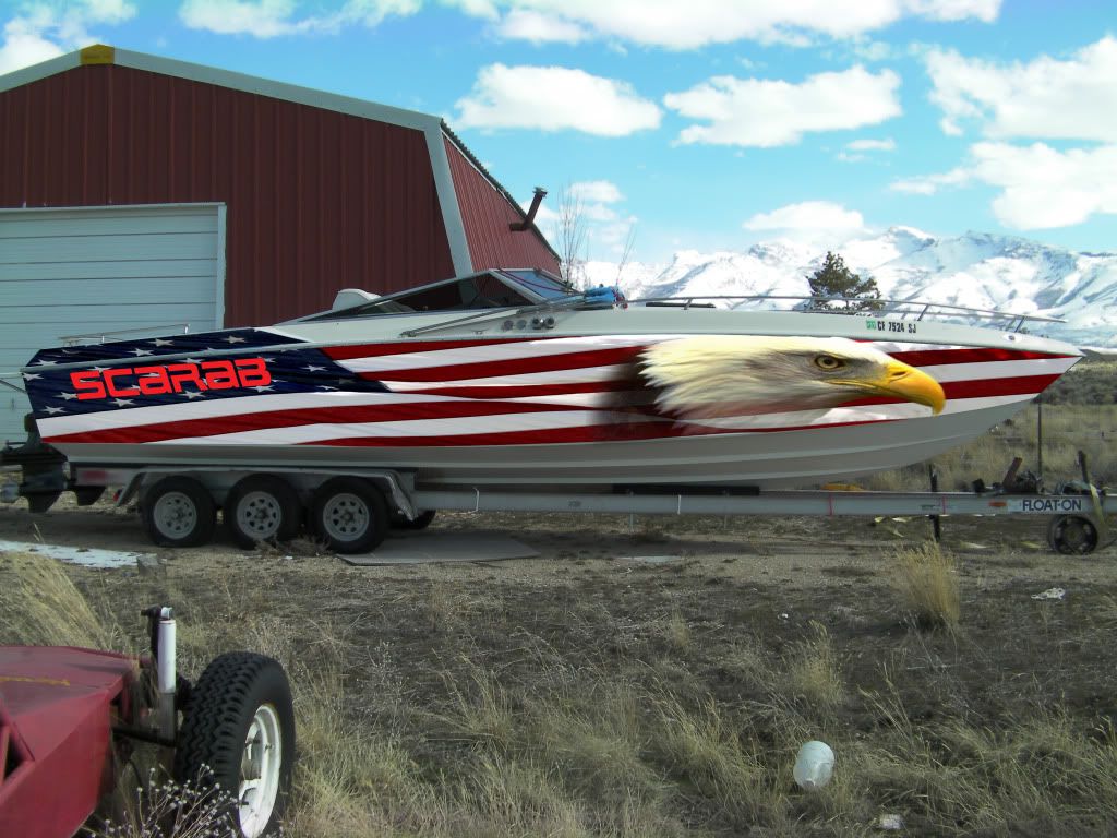
My new ScarabII vinyl wrap design

 04-29-2011, 10:02 PM
#9
Registered
Join Date: Jun 2005
Location: NY
Posts: 716
Likes: 0
Received 0 Likes
on
0 Posts
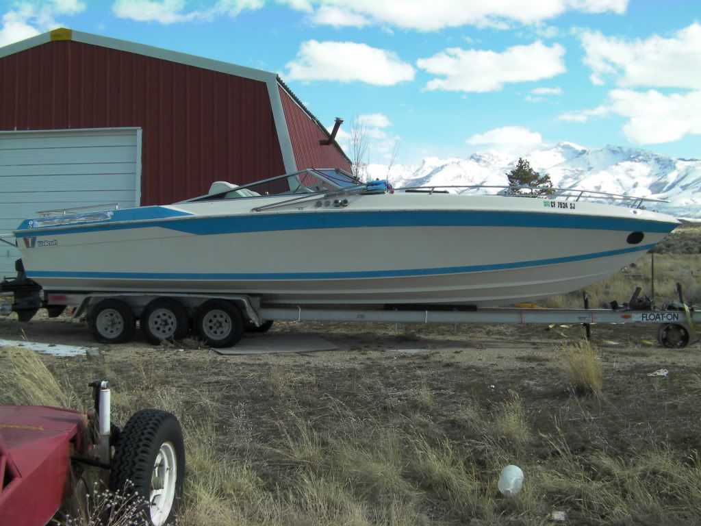
I agree, I like the eagle but it does not fit the boat, how about putting a "ghost" style "30" up where the eagle is, like a Nortech style? Just my .02 I love the old old lines!!!!!!
04-29-2011, 11:18 PM
#10
Registered
Join Date: Oct 2004
Location: Long Island, NY
Posts: 870
Likes: 0
Received 0 Likes
on
0 Posts
If the "Scarab" name has to be in a " neon" color, I would rather not have the Scarab name on it. Make people try to figure out what kind of boat just went past. I do agree that the old graphics ( or lack thereof ) looked better. If you did have the boat done over, then I apologize for my comments. If you didn't have it done yet, then I think you shouldn't. Good luck. Godspeed

