
Mercury Racing Logo Revised
 02-14-2014 | 03:13 PM
#1
Thread Starter
Correspondent

Joined: Jul 2005
Posts: 2,776
Likes: 638
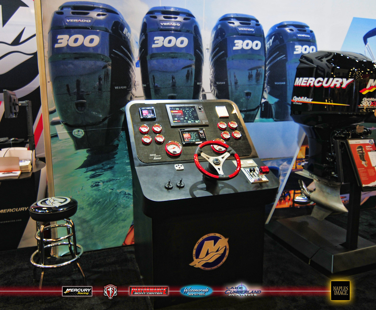
It's not as newsworthy as the 540 engine, but Mercury Racing unveiled its new logo on several products at the Miami International Boat Show. What ya think?
http://speedonthewater.com/in-the-ne...g-logo-revised
http://speedonthewater.com/in-the-ne...g-logo-revised


 02-14-2014 | 04:32 PM
#4
Forum Regulator


Joined: May 2001
Posts: 24,215
Likes: 1,614
From: Worldwide
The logo that Jason is referring to is what's on the valve covers in that picture, as opposed to what you see here:
https://www.google.com/search?q=merc...+logo&tbm=isch

As for the 520/540 engines..
...while I agree that the throttle body looks a little giraffe like, that actually improves air flow ever so slightly. It's all fly-by-wire stuff and it looks like the motor for such takes up a little more real estate than the older linkage assembly.
AND the "496" metal cage flame arrestors actually flow better than the K&N and other foam elements; especially when you peel off a couple layers. (Raylar tested such some time back.)
https://www.google.com/search?q=merc...+logo&tbm=isch
As for the 520/540 engines..
...while I agree that the throttle body looks a little giraffe like, that actually improves air flow ever so slightly. It's all fly-by-wire stuff and it looks like the motor for such takes up a little more real estate than the older linkage assembly.
AND the "496" metal cage flame arrestors actually flow better than the K&N and other foam elements; especially when you peel off a couple layers. (Raylar tested such some time back.)
Last edited by Sydwayz; 02-14-2014 at 04:43 PM.
")
 02-14-2014 | 09:55 PM
#10
VIP Member
Joined: Feb 2003
Posts: 18,696
Likes: 201
From: North Carolina
As for the 520/540 engines..
...while I agree that the throttle body looks a little giraffe like, that actually improves air flow ever so slightly. It's all fly-by-wire stuff and it looks like the motor for such takes up a little more real estate than the older linkage assembly.
...while I agree that the throttle body looks a little giraffe like, that actually improves air flow ever so slightly. It's all fly-by-wire stuff and it looks like the motor for such takes up a little more real estate than the older linkage assembly.
New to me.
ETA: this is a company with a lot of products. Like all large companies, they need constant refreshening of the brand.
Look how many different sizes, applications and marks are in this one shot.
Last edited by jayboat; 02-14-2014 at 10:14 PM.

